
Finishes Only Work When the Space Works
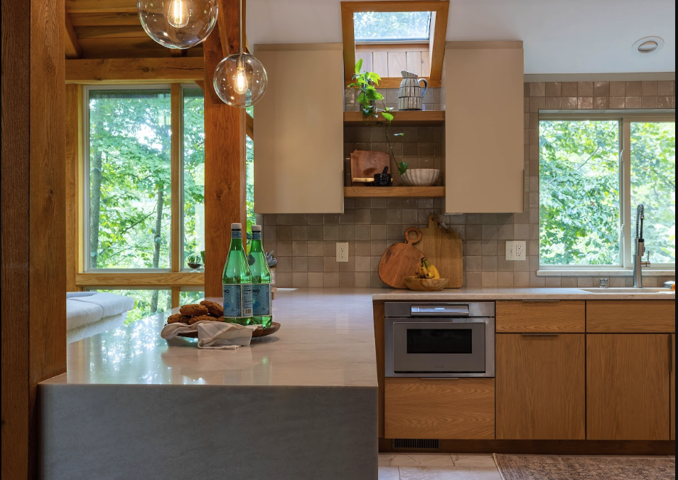
Finishes are the part clients worry about most — but they’re actually the smallest part of the process. Here’s how every finish selection in the Birney kitchen came together because the plan was already solid.
The Part Clients Think Matters Most
When most people think about a kitchen renovation, they think about finishes. The countertops, the cabinet color, the backsplash tile. That’s where their imagination goes — and honestly, we get it. Finishes are the fun part. They’re what you see in magazines and save on Pinterest.
But here’s what we know after years of doing this: finishes are actually the smallest part of the process. Not because they don’t matter — they do. Every selection needs to work together and coalesce into something cohesive. But finishes can only do their job when the space underneath them already works.
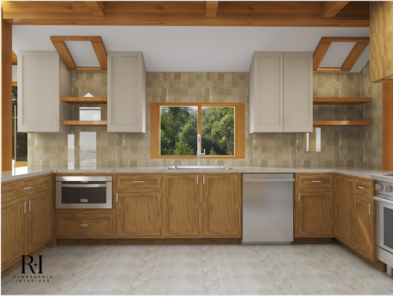
That’s why we spend so much time on the plan, the layout, and the architecture before we ever open a sample book. By the time we got to finishes on the Birney kitchen, we already knew exactly what we were working with — and every selection followed naturally from there.
The Countertops: Quartz Taj — and the Detail Nobody Talks About
We selected Quartz Taj for the countertops — a soft, warm stone-look quartz with beautiful natural movement. It reads light without feeling stark and it bridges the gap between the warm wood tones in the space and the cooler painted upper cabinets.
But the countertop story doesn’t end at the material selection. With columns sitting in key positions throughout this kitchen, we had to work closely with the fabricator to plan exactly where the seams would fall. A seam in the wrong place — right at a column, or in the middle of an island run — would interrupt the flow of the stone and draw the eye for all the wrong reasons.
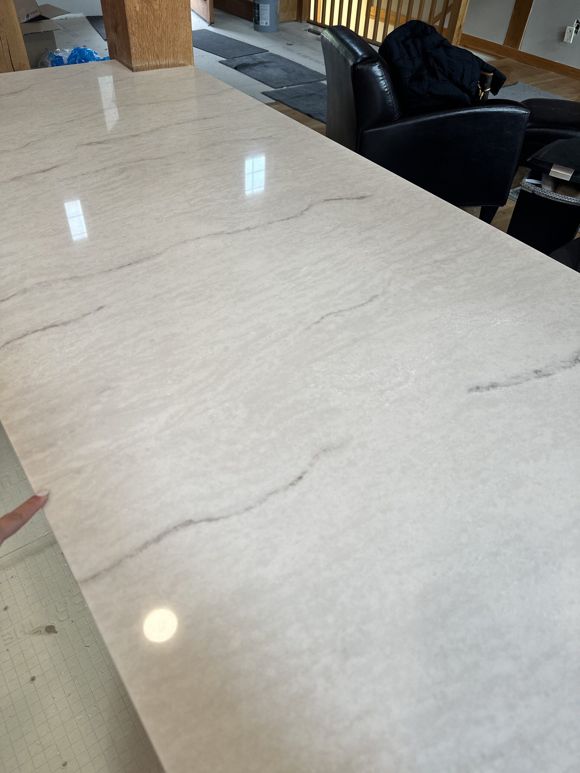
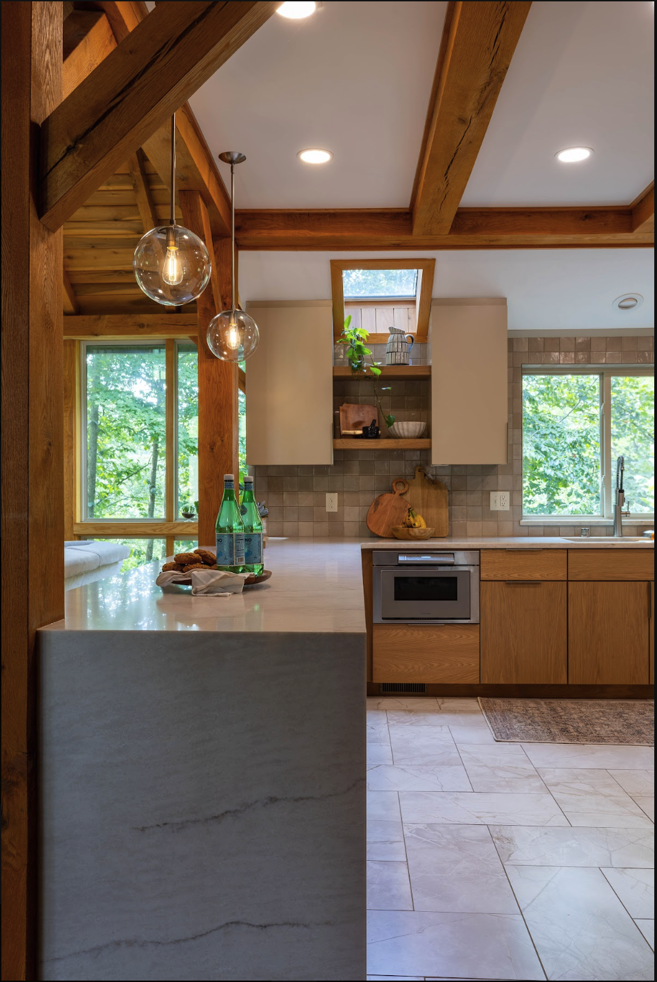
We also incorporated a waterfall edge on the island — where the countertop material continues down the side panel to the floor. It’s a clean, modern detail that adds a sculptural quality to the island and feels completely intentional in this space.
The Cabinets: Two-Toned for a Reason
This kitchen is two-toned — and it wasn’t a trend decision. It was a design decision rooted in the existing architecture of the home.
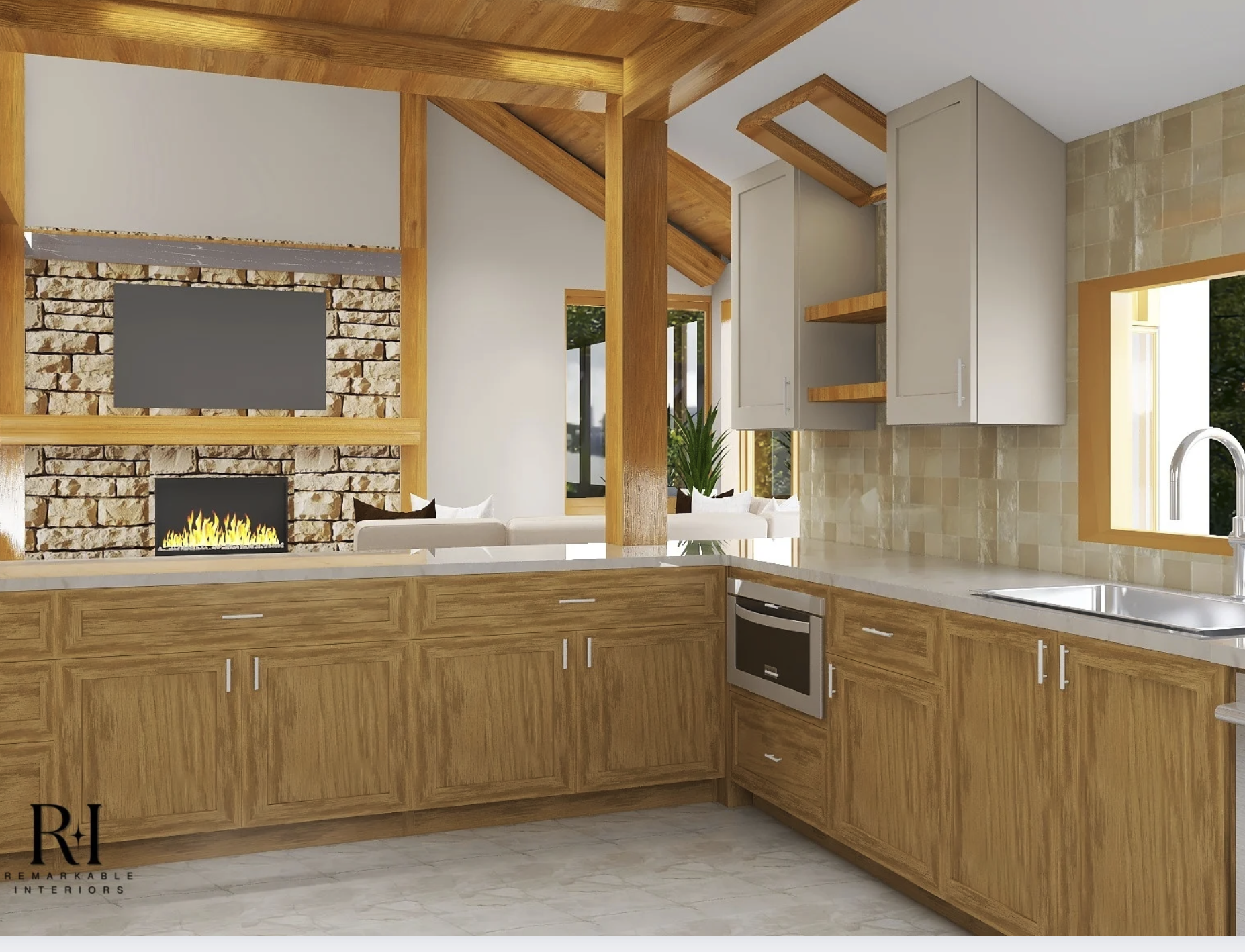
The base cabinets are Wicker on Oak — a warm, natural wood finish with beautiful grain character. The upper cabinets are stained in Sherwin-Williams Loggia, a soft greige that reads warm and calm. Both are slab door style, which keeps the overall look clean and lets the materials speak for themselves.
The reason we chose Wicker specifically comes down to the timber frame. The home has existing posts and beams in honey-toned wood throughout the main floor. We didn’t want to paint them. We didn’t want to restain them. We wanted to honor them — and the Wicker finish on the base cabinets does exactly that. It coordinates with the existing wood without matching it perfectly, which is actually the goal. Perfect matches look forced. Coordinated tones look intentional.
The Backsplash: Imperfectly Perfect
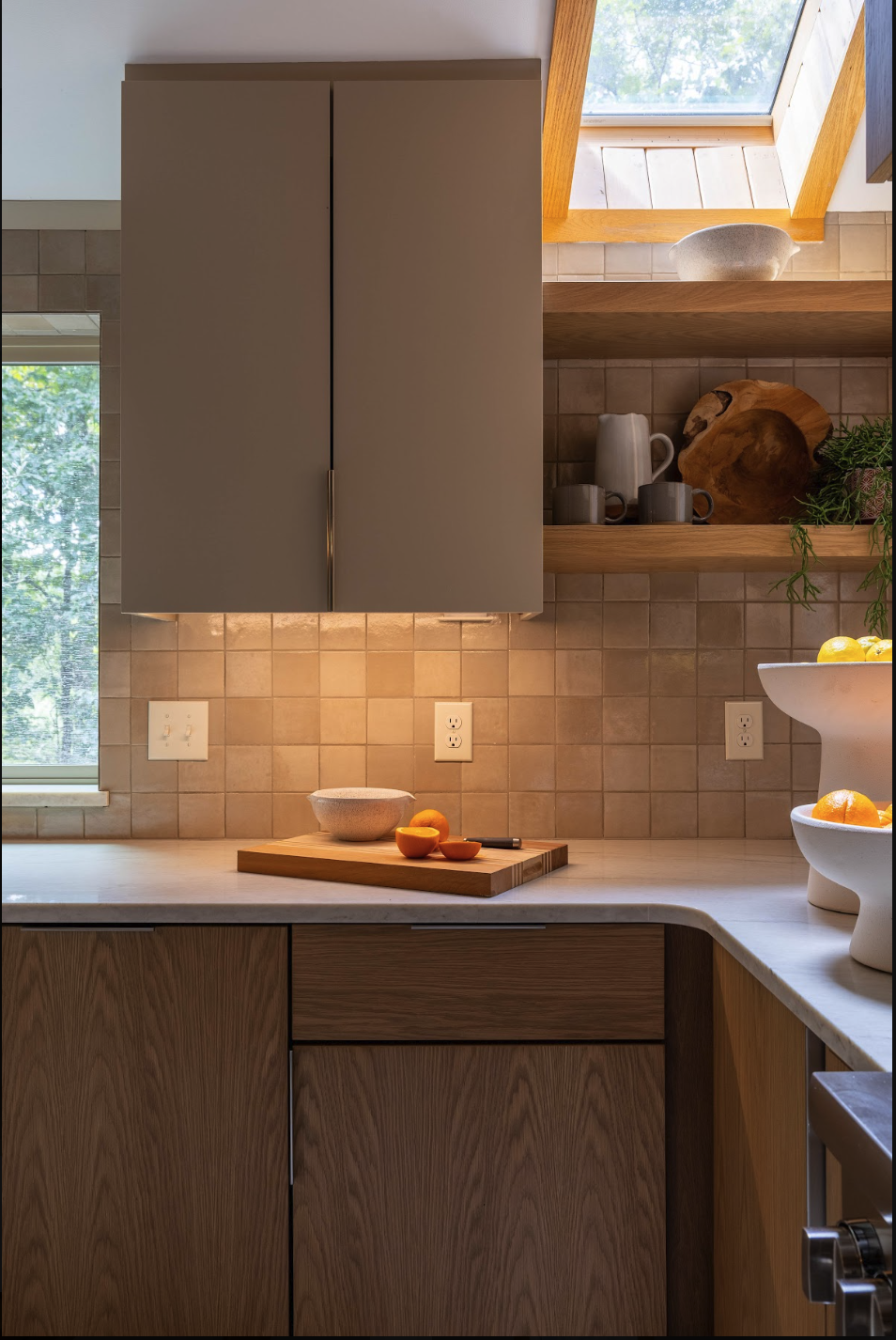
Zellige tile has had a moment — and we’ll be honest, we’ve used it before. But in the Birney kitchen, it wasn’t a trend choice. It was the right choice.
Zellige is a handmade Moroccan tile with natural color variation and a slightly irregular surface. No two tiles are exactly the same. In a home with this much character — exposed timber, stone fireplace, natural wood everywhere — a perfectly uniform tile would have felt out of place. The Zellige in Lana, laid in a grid pattern, gave us warmth, texture, and life on the wall without competing with everything else happening in the space
We think of it as imperfectly perfect — and for this home, that’s exactly right.
The Flooring: Movement, Warmth, and a Layout That Earns Its Place
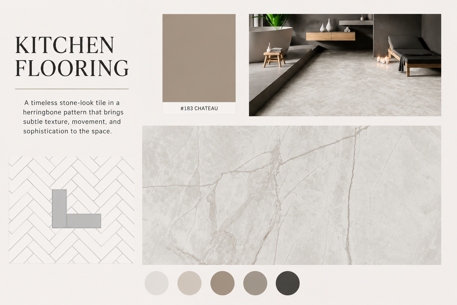
The kitchen flooring is Origin 21 Lucca Chalk — a 12×24 matte porcelain tile with a soft chalky stone look and just enough warmth and gold undertone to anchor the space without overpowering it.
We laid it in a herringbone pattern. For a tile this size, herringbone is a commitment — it takes more material, more time, and more precision to install. But when you’re working in a kitchen with this much architectural interest happening overhead, the floor needs to hold its own. The herringbone layout gives the floor movement and energy that a standard grid simply wouldn’t.
The Lighting: The Final Layer
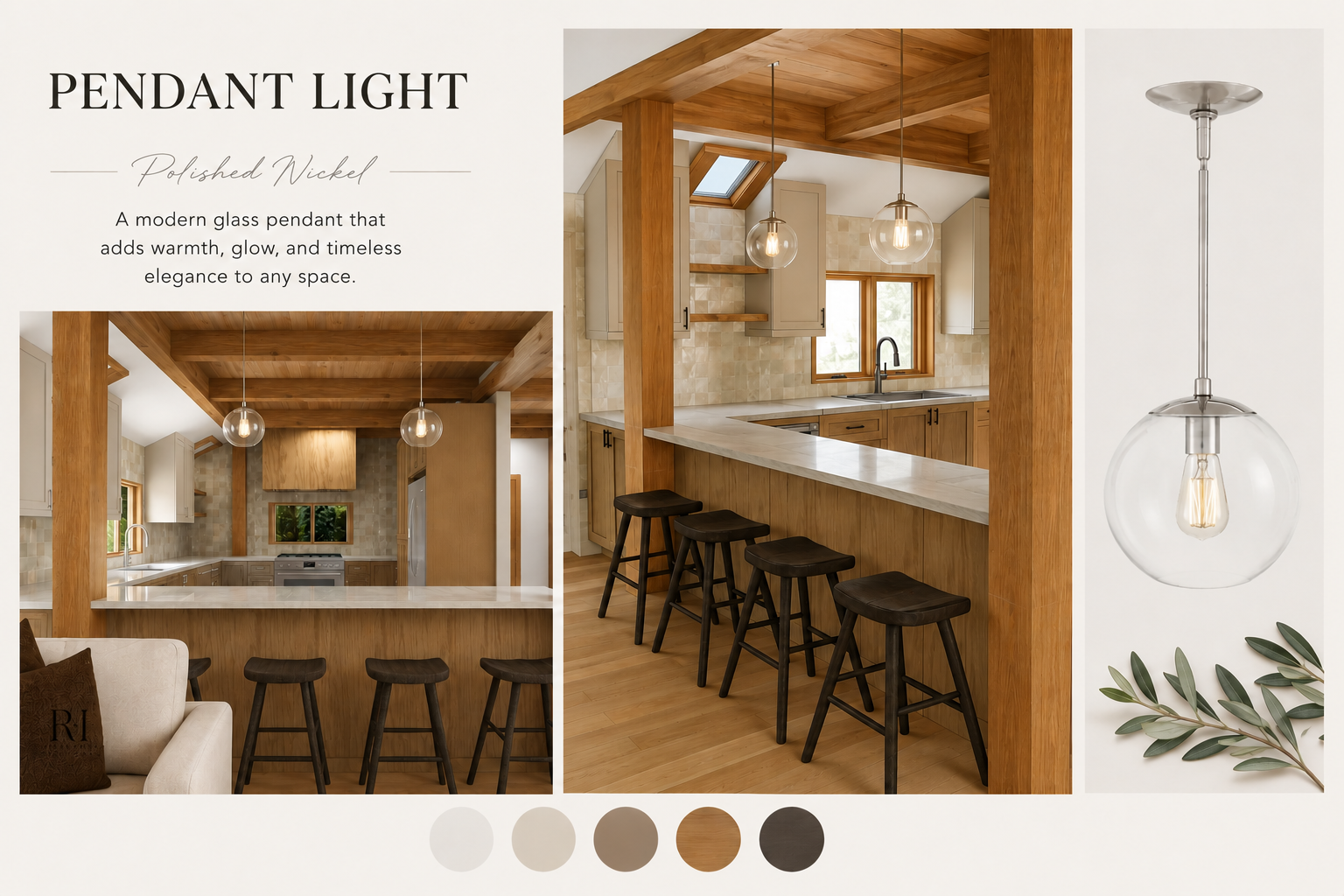
Over the island, we selected globe pendants in polished nickel. They’re clean, they’re classic, and they work with the warm wood tones without disappearing into them. The globe shape adds softness to a kitchen that has a lot of strong lines — columns, cabinetry, the herringbone floor — and the polished nickel finish ties into the hardware throughout the space.
Everything Works Because the Plan Worked First
Every finish in this kitchen — the countertops, the cabinets, the backsplash, the flooring, the lighting — was selected in the context of a space that already made sense. The columns were accounted for. The layout was locked in. The architectural challenges were solved.
That’s what allows finishes to do what they’re supposed to do — bring a space to life. Not carry it.
In our next post, we head to the master bathroom — another space with big potential and a design story worth telling.
Ready to talk finishes — but want to make sure your plan is solid first?
That’s exactly how we work. Let’s start the conversation.